

The Look developed a richer, more nuanced visual language for the second season of Disney+’s Rivals
The Look completed the HDR and SDR grades for the second season of Disney+’s Rivals.
Early conversations focused on what the world should look like, how it should feel, and how the visuals best support the storyline. “It’s rare that a director or DP wants to start by talking about HDR,” explains colourist Thomas Urbye.
The series look was developed within DaVinci Resolve Studio, which served as the hub for look development, HDR grading, Dolby Vision trims and SDR delivery.
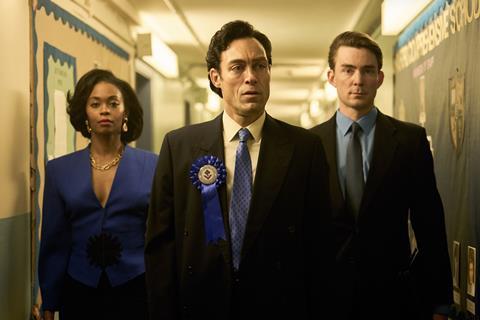
Urbye and fellow The Look colourist Grace Weston pushed colour separation, chroma contrast and image depth further than in season one, creating a richer visual language that could support both the show’s vibrant energy and its darker dramatic moments.
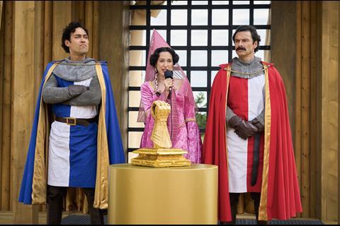
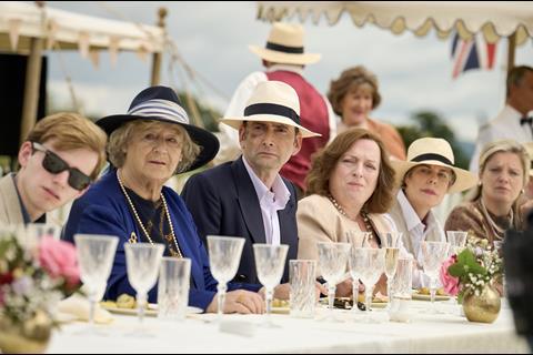
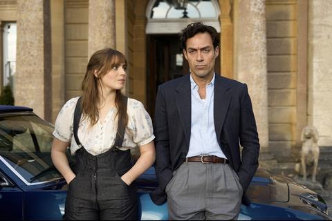
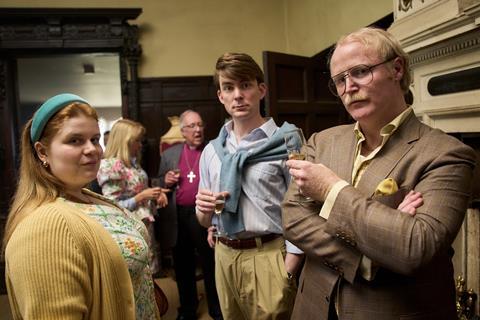
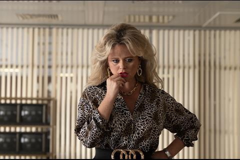
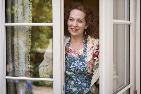
Rivals is filled with bright interiors, sunlit exteriors and highly saturated production and costume design. For Urbye, the HDR format offered the opportunity to take greater advantage of that visual richness. “You find your look in HDR,” he says. “And on Rivals that naturally sits higher than perhaps a moody thriller because of the sunny exteriors and bright interiors.”
The benefits became particularly apparent in skies, skin tones and primary colours. Using DaVinci Resolve’s Colour Warper and Colour Slice tools, Urbye created greater depth within specific colours, particularly the reds, greens and blues that feature heavily throughout the series.
“This is where you see a significant advantage in HDR,” he explains. “The contrast range and colour depth in skies, skin tones and saturated primary colours are noticeably richer.”
The aim wasn’t to make the show more colourful, but more nuanced. HDR provided additional colour volume and tonal separation, enabling bright scenes to feel closer to the way they are experienced in the real world. “HDR isn’t hyper realistic,” says Urbye. “It simply allows a visual range that is closer to our experience of the world around us.”
For Weston, HDR’s greatest strengths emerged in supporting the story. “HDR gives us the capability to show extra information in the highlights,” she explains. “It allows us to boost contrast and colour to create the appearance of sunlight where we didn’t necessarily have it in the original footage.”
While the HDR master represented the primary creative version, Rivals also required an SDR deliverable.
“The most difficult scenes to transfer from HDR to SDR tend to be day exteriors,” says Weston. “You lose some of the punch of the scene, and often a choice has to be made between preserving the contrast or preserving the overall luminance.”
The Look did not treat the SDR version as a simple down conversion from HDR. DaVinci Resolve’s Dolby Vision tools provided the starting point, but the final pass was judged and trimmed shot by shot to keep the SDR master consistent with the look established on set and refined in the HDR grade.
The ability to review HDR and SDR side-by-side within the same workflow allowed the team to quickly evaluate trims, compare deliverables and respond to late stage changes.
The primary consideration throughout the process was consistency between versions. “It was important to preserve a single visual language across two formats to ensure audiences could experience the same world, regardless of how they are able to watch it.” Weston concludes.
The series was produced by Happy Prince with key creatives including directors Elliot Hegarty and Jamie Jay Johnson, DPs John Lynch and Ashley Barron and series producer Eliza Mellor.





No comments yet