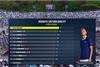
Deltatre CEO Andrea Marini and ATP Media director of production & content services Dominic Gresset speak to Broadcast Sport

ATP Media Deltatre tennis graphics medvedev

Deltatre and ATP Media have launched a new set of graphics for the ATP Tour.

Following the graphics’ introduction, Broadcast Sport spoke to ATP Media director of production & content services Dominic Gresset, and Deltatre CEO Andrea Marini, about why the new look was necessary.

The new features include AI-generated contextual insights, such as players’ performance on certain shots, live rankings, 3D tournament locator maps, and more, hoping to keep the competition at the “top of the curve” of graphics, as Gresset explained. The data behind some of these innovations comes from Tennisviz and Tennis Data Innovations.

He added: “We normally refresh every contractual cycle, or three-to-four years [Deltatre has worked with ATP Media since 2017]. When you look at old graphics, they date very quickly.”

He continued on the style: “We wanted to give a bit of depth to highlight the most salient bits of the data, for example having the set winners highlighted. You want to appeal to the hardcore, but also general sports fans and new fans.” It was also important to tell, “the story of not just the match, but the season as a whole” when working with a rights holder which has 250 days of tennis in 2023. 

A dedicated team of around 35 at Deltatre work on the graphics, covering design and development as well as delivery. Marini explained that the sheer amount of sport isn’t the only difficulty with tennis, “It’s not easy as a sport, it’s fast and people keep going for a long time.” 

ATP Media Deltatre tennis graphics

In addition, “dealing with an established sport, where people are used to seeing the game in a certain way, is a challenge. You have to be innovative and creative, but not too much!”

As for the new data that has come in this year, AI has been used to try and bring objectivity to areas of the game that have been called subjectively by commentators in the past. For instance, how well a player is serving, or returning serves. Gresset explained: “We want to make [the graphics] tell the narrative of the data, for example helping new fans understand his forehand is a 7.2 when it’s usually a 7.7.”

He added: “In the past, it’s been very subjective – five different loggers can see five different numbers of unforced errors in a game.”

3D location maps that show the games taking place aim to give viewers a taste of the countries that the Tour travels to, and Gresset even wants viewers at home to “see our coverage and think ‘I have to go there’”.

Looking forward, Marini expects “more colour and context” to be added to the graphics as well as further automation - which again would help with the amount of content needed to be covered. Meanwhile, Gresset wants, “to show the head to head rather than just one player at a time, e.g. to show it’s a high quality serve v a high quality return, which should make a good match.”