

Director Charlotte Regan, DP Christopher Sabogal and colourist Simone Grattarola explain how they created a distinctive visual style for BBC’s crime-drama
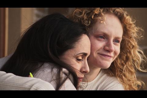
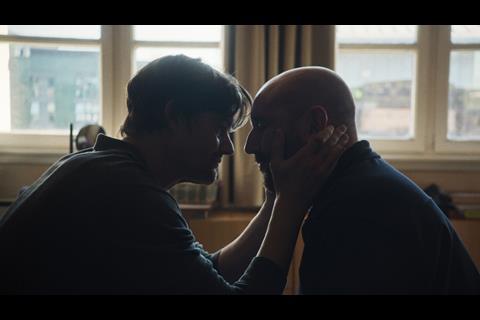
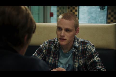
When director and writer Charlotte Regan began developing Mint, she didn’t want to follow the well-trodden path of a predictable British crime-drama. Instead, she set out to create something more distinct that blends crime, romance and dark comedy, told through an emotionally driven lens.
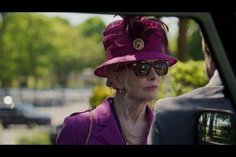
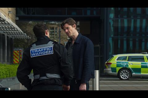
The eight-part BBC One series Mint follows the story of an unlikely love match between rival crime families in the UK. To help achieve the vision, writer/director Charlotte Regan collaborated with DP Christopher Sabogal and colourist Simone Grattarola of Time Based Arts.
Sabogal’s involvement stemmed from a long-standing creative relationship with Regan. “I’ve known Charlotte for about five years, and we’d always talked about doing something longer form,” he said. “She mentioned this project a while ago and it stood out to me. While set in the crime family world, it’s ultimately a love story. The contrast was refreshing and I was excited to be involved in bringing it to life.”
From the beginning, Sabogal and Regan were determined to steer away from visual clichés. “She didn’t want to create a gritty, dark British drama,” he says. “Instead, she wanted something lighter and brighter. Think less Gamora, more Barbie.”
To help flip these expectations and begin shaping the approach, Sabogal relied on Grattarola to help build the visual profile in DaVinci Resolve Studio. “It was a bit like a blind date,” said Sabogal. “We knew each other from brief encounters, but nothing more. Lots of directors had said we would get on well, and we did.”
“We created a mood document in early development, pairing script impressions with visual references to avoid locking in any rigid styles and keeping the process fluid. This gave us a base to then start questioning the visual language, camera movements and lenses,” explains Sabogal.
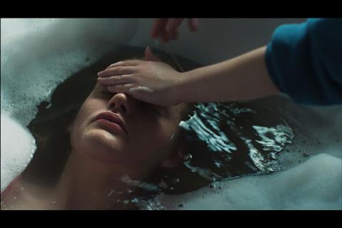
Sabogal paired an Alexa 35 with vintage K35 lenses for softness and texture, alongside Hi8 footage to add a nostalgic, lo-fi (low fidelity) quality. “The aim was to build a tapestry of different textures that contributed to the tone,” he says.
Throughout the production, Sabogal stayed connected to Grattarola by sharing stills and references throughout the shoot via a shared Dropbox folder. “It meant we were able to start experimenting straight away,” said Grattarola. “You try things, discard a lot and eventually hone in on what feels right rather than grading to dictate the look.”
That philosophy was an anchor point once the team entered the grading suite. With four weeks to work with, Grattarola describes a collaborative process with Regan periodically reviewing progress. “She had a scoring system. If we got a 10 out of 10, we nailed it. If it dropped to a six, we had to rethink it.”
Rather than relying on heavy stylistic treatments, the grade focused on subtle refinements. “We didn’t want colours to feel overly digital or out of place. We wanted richness and density for a more filmic finish,” he says. “We got to this through a combination of carefully controlled grain, diffusion and selective colour shaping, which allowed the image to retain a natural yet heightened look.”
In a sequence with flashing lights against a dark background, the team used DaVinci Resolve’s Depth Map to isolate foreground elements. “We needed to keep the characters lit while casting the background in shadow. Depth Mapping gave us that separation without unnatural masking,” he describes.
Other scenes required a more expressive touch. A scene with translucent plastic sheeting was pushed towards a dreamlike aesthetic using blur, diffusion and layered grading techniques. “It was about enhancing what was already there,” says Grattarola. “Sometimes you push things a bit far, then you realise less is more and reign it back in.”
For Sabogal, that discipline was one of the keys to the show’s success. “The craft in Simone’s work is that you don’t need to see it because it’s incredibly precise and it becomes an organic part of the storytelling.”
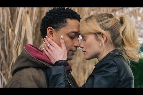
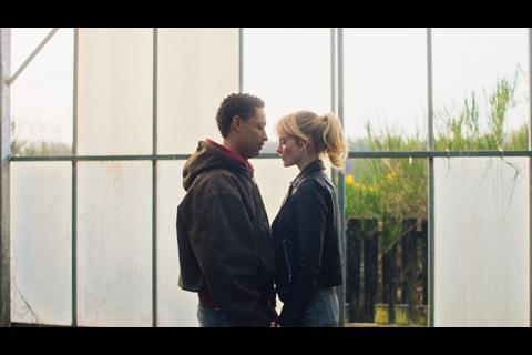
Amongst some standout moments, both Sabogal and Grattarola highlight scenes where tone and technique align perfectly. From an intimate kiss in a greenhouse, to more stylised and dramatic pieces. However, in reflecting both agree that the cohesiveness of the storytelling is “a sum of all parts”.
The series was delivered in both HDR and SDR formats for the BBC. While HDR offered greater dynamic range, the team prioritised keeping a consistent emotional experience across both versions. “We actually started with SDR,” Grattarola reveals. “That’s how most people will watch the series, and it gave us the softer, more ethereal quality we wanted. HDR was then carefully adapted to match that feel.”
Mint is available on BBC1 and BBC iPlayer.


No comments yet