


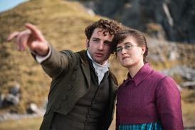


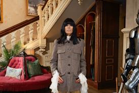


Company 3 handled colour for the final season of the iconic show
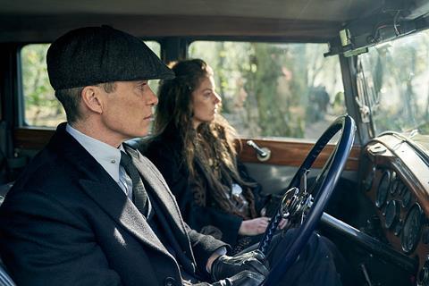
Peaky Blinders wrapped its final series earlier this year, and Company 3 has revealed how it continued the show’s distinctive style and colour.
Directed by Anthony Byrne, written by Steven Knight, and produced by Caryn Mandabach Productions in association with Tiger Aspect, the series is now available in full on BBC iPlayer in the UK, or on Netflix internationally.
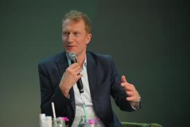
Company 3 handled colour for the final series, using DaVinci Resolve. Senior colourist Paul Staples said: “I was delighted to be invited to return to grade season six.
“Colour has been an incredibly unifying and symbolic force throughout Peaky Blinders, and frequently underpins or foretells moments of drama, or gives insight into a character’s subconscious. Additionally colour has played a role in highlighting certain folkloric aspects in Steven Knight’s writing. This made it simultaneously a complex and incredibly satisfying show to work on.”
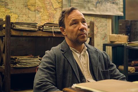
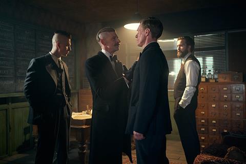
Such visual ideas, he explained, originate with Knight’s script and then percolate through director Byrne and then DoP Mathieu Plainfossé. D.I.T. James Shovlar plays a key role during principal photography helping to ensure that the creative vision is maintained during shooting. He would balance shots before passing them to the cinematographer for his feedback. Once the notes had been addressed, Byrne would add his take. Once episodes were cut, they’d go to Company 3 and Staples (who also coloured Season Five) for final colour in DaVinci Resolve.
Company 3 finishing editor Simon Brook also worked in Resolve so that colourist and editor could share the same project and changes could seamlessly be incorporated into the timeline.
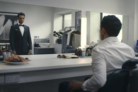
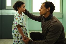
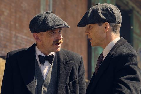
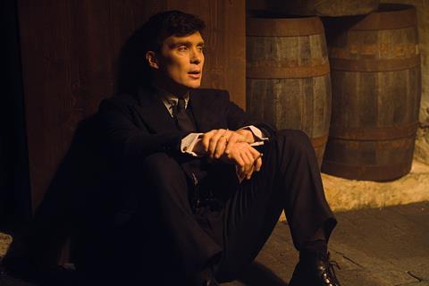
The setting of the series has progressed from its earliest episodes, which take place just after WWI, to the final season set in the mid ‘30s. For this season, Staples revealed: “The show was lit very differently from season five, which makes sense since [the action] is separated by several years in story terms. I felt that season six showed the heaviness weighing down on Thomas Shelby. He’d achieved a great deal but that came with a huge responsibility on his shoulders, not to mention the situation with his health. It’s not ’bright’ and ‘optimistic,’ but also, it’s not a ‘grim’ or ‘depressed’ feeling. It’s more subtle and nuanced. Anthony’s term was ‘Gothic,’ and I’d say that exactly describes the feel.
He continued: “The lighting was soft and silky, and we worked tirelessly to present a contrast ratio that would be true to its intention, that is, for the [imagery] to have a painterly feel. Every part of every episode in the entire series arc was linked in Anthony’s mind, and there is a thread that runs through every single shot and frame, coming to a climax in the final episode. There was an elaborate and subtle colour language that ran through the whole drama, and united all of the departments together, creating such an incredible and compelling piece of drama.”
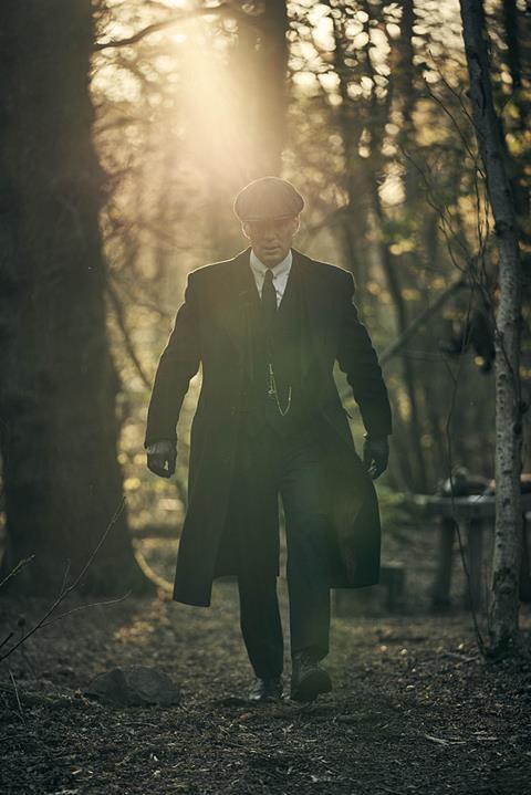
One of the common visual elements throughout Peaky Blinders has been the colour gold. The series even has its own shade of gold, “Peaky Gold” as the filmmakers referred to it. Staples noted: “Anthony had said that gold was a key theme within the show. It is a recurring motif in the show, symbolizing the wealth of some of the characters. The Shelby pocket watches are gold, when conventionally, pocket watches of that era would be silver or nickel-plated. I did some fine rotoscope work in Resolve, frame by frame to finetune just the gold elements.”
Colors can take on multiple meanings, Staples adds, and the gold is symbolic of more than merely wealth. “Gold also has a presence in Romani custom and folklore,” he explained.
Staples is quite proud of his work on this visually compelling series and will be sad to see it end. He summed up: “We always needed to be respectful of both the deeper meanings contained within the visuals, but also balance visual consistency with previous seasons and to accomplish that while maintaining a sense of progression from season to season. This is the type of show colourists love to work on.”


No comments yet