


Framestore created the Game of Thrones inspired redesign of the Sky Atlantic logo, which was devised by Sky Creative Agency
Sky Atlantic’s branding has undergone a temporary Game of Thrones inspired update, to mark its televising of the eighth and final season of the iconic series.
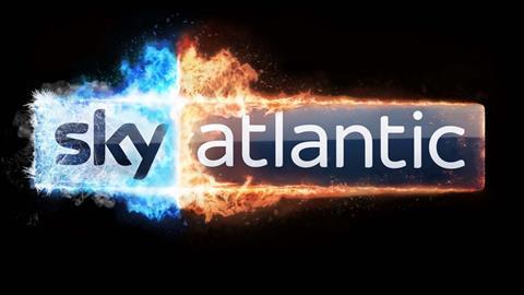
The ‘channel takeover’ has been devised by Sky Creative Agency (SCA) and created by Framestore. The theme is ‘The Living vs The Dead’ and sees the Sky Atlantic channel logo in “opposing dragon fire; the red fire of the living and the blue fire of the dead, creating a visually bold representation of the imminent finale,” says SCA.
It’s a multi-layered animated Sky Atlantic logo that apparently pushed Framestore’s pipeline to its limits. The rendering of the logo alone required 15 hours of rendering per frame to achieve the level of detail required.
Everything from promos to social and continuity idents, and a Sky Sports Premier League studio-takeover ahead of the first episode on 15 April, have been adapted to the new Game of Thrones theme.
Sky Creative Agency creative director Oli Francis, said: “In previous years we froze the logo and for the finale we really wanted to heat things up. Using dragon fire to burn the logo to within an inch of its life seemed like an apt way of doing that. I must admit we took some pleasure in nearly breaking Framestore’s pipeline.”
See how it was created below.


No comments yet